Daniel’s Legacy
All Pad’s clients have important stories to tell, but there are some that really resonate with the team. When Pad designer Leah Martin was asked to design a brochure for the DSM Foundation she was touched by the tragic story of Daniel Spargo-Mabbs, a bright, articulate, popular, kind, funny and talented young man. He was one of the very last people anyone would have expected to come to harm from drugs. And yet, on 17 January 2014, he made a decision which was to cost him his life. On his way to a rave party he bought and took a dose of ecstasy. Dan fell into a coma and died three days later after doctors were unable to save his life. He was just 16.
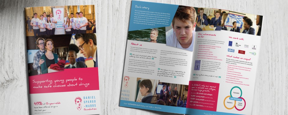
The DSM Foundation (dsmfoundation.org.uk) is a charity that educates pupils and students about the dangers of drugs. It was founded by Dan’s parents, who felt no young person should be faced with a decision about drugs without the knowledge and the skills they need to make informed and safe choices, and that no more young people come to harm.
Leah was excited to be given the opportunity to produce a new brochure for the Foundation. She said: “I did a lot of research into the charity which helped a great deal. I was inspired by all the campaigns and events they do, and the youthful aspect really motivated me to create something different, dynamic and engaging. I wanted to ensure I made the booklet as eye-catching and fun as possible to really speak out to the readers. I also felt from what I have read about Dan that it should reflect his happy and fun-loving nature.
Pad was recommended to the DSM Foundation by Management Consultant, Elizabeth Beroud (www.beroudconsulting.com), who had worked with them on a previous project. When Elizabeth was asked to help the Foundation with its marketing, she immediately suggested Pad as the ideal design partner. She said: “The aim of the brochure was to engage new audiences with the important work that the charity was undertaking and become a useful support tool in its drive to scale up its operations. DSM’s logo is a line portrait of Dan and I was keen that Pad built on the logo, which includes two contrasting fonts and colours, without being constrained by it. I wanted the brochure’s design to capture the energy and appetite for life of adolescence, but also its impulsiveness and uncertainties, so part of the brief was to create a style that was young and energetic with plenty of visuals.
“Leah immediately found the right visual identity for the brochure. Her stroke of genius was her treatment of the photos, with slanting edges that don’t always meet up. The deconstructed look creates interest and suggests movement in a way that reflects the multi-facetted, evolving nature of youth. Leah also developed the colour palette and added shades of yellow and green that complemented the existing blue and red. Although she used the new colours sparingly, it helped give the body text a real lift and the diagrams added interest.
“I could tell that she was really inspired by the story of Dan and it was nice to think that she was as proud as I was to be working for such a good cause. In fact, I would say that one of Pad’s distinguishing features is the depth of relationship they build with their clients. I consider them more as partners than suppliers.”
For Leah, it’s been a privilege to work on the project, so feedback from Dan’s mum, Fiona, means a lot. Fiona is the Founder, Director and Operations Manager of the DSM Foundation and she said: “I really valued not only Pad’s hard work, skill, and the speed with which they responded to any feedback and suggestions we had, but their apparent commitment to the cause and purpose of our charity. We’ve been able to make good use of the brochure already and are so pleased and proud to have such a high-quality product to present to potential funders and partners.”