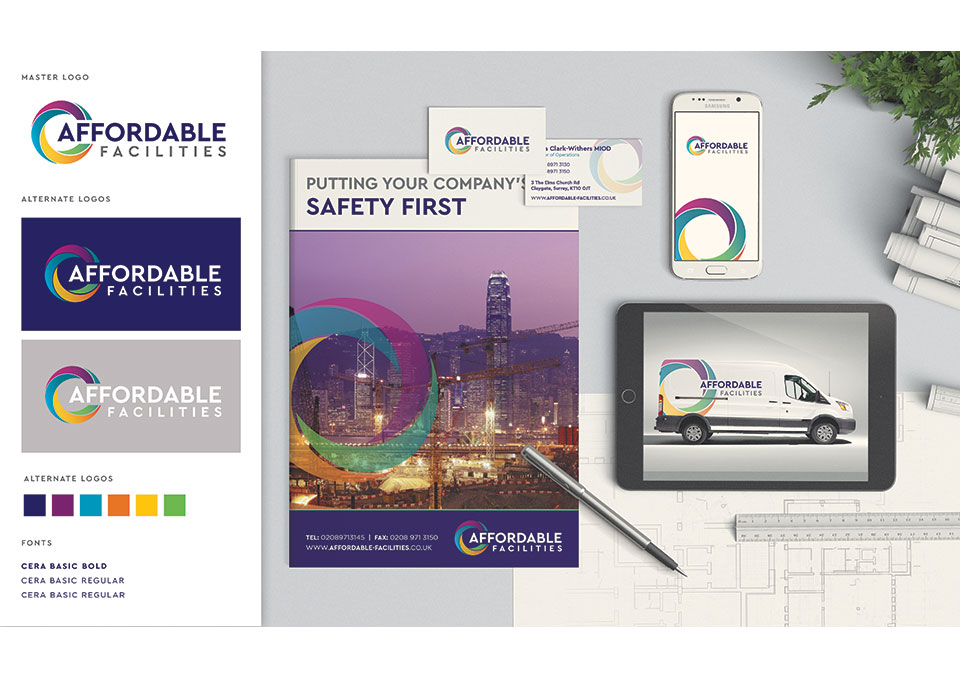
Fresh, new look for Affordable Facilities
25 May 2016
Construction site security specialist, Affordable Facilities, has a new logo and website – all created by Pad.
Affordable Facilities is one of the top hoarding suppliers in London, providing hoardings, security and alarms to the construction industry.
Director of Operations Laura Clark-Withers chose Pad after a personal recommendation, and she wasn’t disappointed. She came to Pad because she felt the company’s previous logo and website needed updating. She said: “Our previous logo was rather bland and we had a square and rigid website which looked and felt so dated. The work Pad came up with is fresh, vibrant, and most importantly, current. They were able to deliver the whole package: branding, website, brochure, business cards and letter headings. I was amazed at the different concepts they came up with and the thought that went into them. I was very happy with their initial ideas so there was very little to-ing and fro-ing. In fact, they pretty much did everything for me. Throughout the project they were very professional and approachable and gave added value in terms of advice on content and layout.”
It was a great brief for Designer, Ilonka Ligteringen. She said: “The offering of hoarding, security and alarms isn’t easily translated into a logo but that meant we could be more creative with a more abstract approach. The icon we used has different coloured segments that are all interlinked. It’s easily recognisable and would work well if Affordable Facilities evolves its offering in the future. We’ve used more conservative business colours of blue and grey for the text which combine with the colourful icon to reflect a company that’s friendly and professional.”
