We’ve got a brand new look
19 March 2015
Notice something different about us? Pad’s branding has had a bit of a makeover and we’re all feeling rather perky as a result.
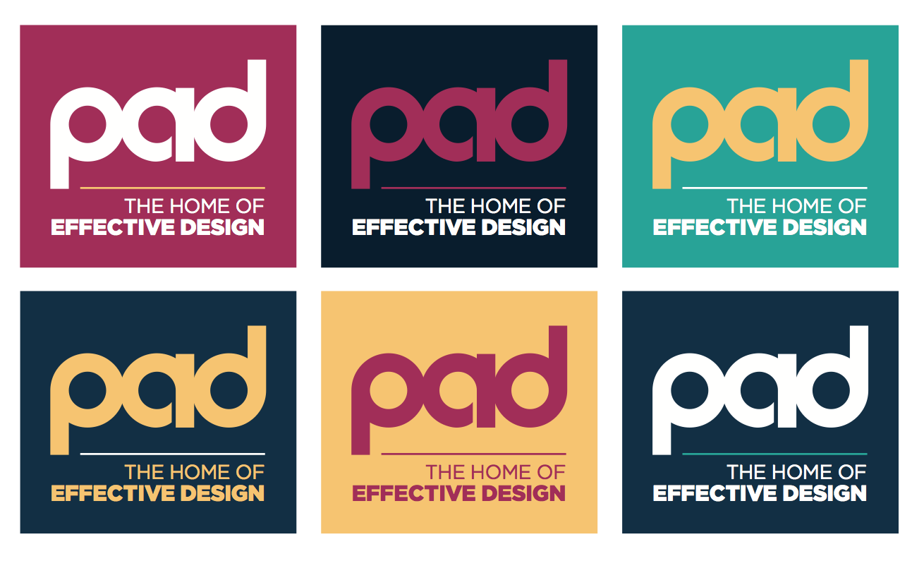
The new look is more of a refresh than a complete transformation. We’ve kept red as our main colour (we know what suits us) and we’ve added a warm, vibrant five-colour palette that gives us lots of flexibility while still retaining a stylish, recognisable look that gets our message across loud and clear.
And that message is now our strapline: The Home Of Effective Design. “That’s the cornerstone of our philosophy,” explained Pete Jacobs, Pad’s Director. “Good design can help a company’s bottom line. Our designs follow proven techniques and effective marketing principles that get results for our clients. It works for our clients and it works for us. Pad continues to grow and our refresh shows that we practise what we preach.”
Along with the five-colour palette (cerise, navy, aqua, yellow and cool grey, since you ask), we’ve included a flexible set of fonts to help give more character and changes in tone of voice. This includes a quirky sans-serif headline font, a slightly retro (but contemporary) script font, a serif font for sub-headings and pull-outs, and we’ve retained our existing sans serif font for body copy.
We may have a new look but we’re still the same, friendly, talented team who want to help your company achieve its potential through effective design.
